Rebecca Kaye’s data art project ‘Always Raining Somewhere’ uses nearly a century of UK precipitation records to visually depict shifting rainfall patterns, highlighting a recent increase in intensity amid climate change concerns.
Always Raining Somewhere: The Art of Weather Data Visualization
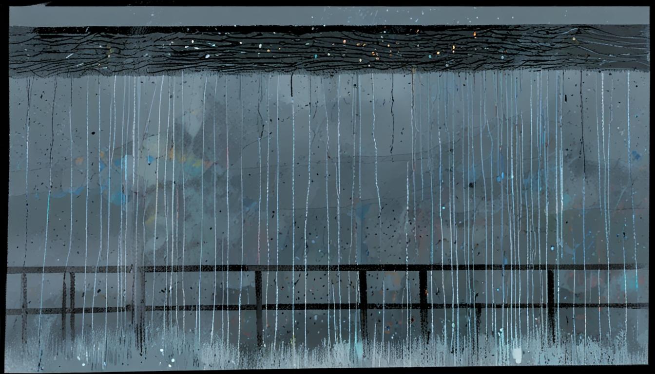
In a world where climate change remains a pressing concern, British data artist Rebecca Kaye, known as Ploterre, has found a compelling way to translate meteorological statistics into visual narratives. Her recent project, “Always Raining Somewhere,” draws on extensive data from the UK Met Office, reflecting on how our weather varies dramatically across different regions and timeframes.
Kaye’s artistic exploration began with a simple observation during her cycling trips around Edinburgh. “It was really apparent when cycling from my home in Edinburgh that it could be dry if you headed west, but wet if you headed east, and vice versa,” she recalls. This curiosity led her to compile precipitation records from 366 locations across the British Isles. The dataset spans from 1934 to the present and primarily focuses on the wettest months, from 1 October to 31 January. In total, her visualisation comprises 122 rows representing days and 90 columns across the years, effectively encapsulating nearly a century of weather patterns.
The visual itself is striking. Faint diagonal lines signify light rainfall, while denser lines depict more intense rain. The outcome mirrors a view from a foggy, rain-soaked window, evoking an emotional response to the often-overlooked, relentless nature of British rain. Yet, Kaye’s work is also grounded in data integrity; although the piece gives the impression that it is “always raining somewhere,” there are noticeable gaps indicating the occasional dry day.
What stands out is the emerging trend evident in Kaye’s piece: as one gazes toward the bottom right of the visualization, it becomes clear that rainfall patterns have intensified in recent years. “You can see the pattern getting darker at the bottom right,” she notes. “It looks to be getting wetter later on in more recent years.” Such observations echo broader climatic shifts documented by the Met Office, whose HadUKP dataset offers comprehensive precipitation data and has been instrumental in similar research.
Kaye’s intent is to humanise data, making it relatable to the everyday experiences of people who live in a frequently rainy nation. “It makes the numbers less dry – pun intended,” she remarks, highlighting her belief in the power of art to provoke thought and emotional engagement with otherwise stark statistics.
Kaye’s work fits into a larger narrative about climate awareness and the innovative use of data in art. The Met Office has made extensive strides in making precipitation records accessible, with archives extending back to 1766. This wealth of information not only serves artists like Kaye but also empowers citizens, as seen in projects that have encouraged community involvement in weather data collection. For instance, a recent initiative involved citizen scientists rescuing over 3.34 million historical monthly rainfall observations, an effort that significantly enriches our understanding of historical weather patterns and trends.
As climate change continues to reshape our environment, the narratives woven by artists like Rebecca Kaye become increasingly vital. By transforming dry statistics into visual poetry, Kaye not only captures the essence of a quintessentially British experience but also contributes to a broader discourse on climate resilience and awareness. Indeed, Kaye’s work reminds us that while it may almost always be raining somewhere, there is also beauty and revelation to be found in our shared meteorological narrative.
Reference Map:
- Paragraph 1 – [[1]](https://www.theguardian.com/news/2025/may/08/weatherwatch-british-data-artist-shows-its-always-raining-somewhere-almost), [[2]](https://www.theguardian.com/news/2025/may/08/weatherwatch-british-data-artist-shows-its-always-raining-somewhere-almost)
- Paragraph 2 – [[1]](https://www.theguardian.com/news/2025/may/08/weatherwatch-british-data-artist-shows-its-always-raining-somewhere-almost)
- Paragraph 3 – [[1]](https://www.theguardian.com/news/2025/may/08/weatherwatch-british-data-artist-shows-its-always-raining-somewhere-almost), [[5]](https://www.metoffice.gov.uk/research/climate/maps-and-data/about/archives)
- Paragraph 4 – [[1]](https://www.theguardian.com/news/2025/may/08/weatherwatch-british-data-artist-shows-its-always-raining-somewhere-almost), [[3]](https://www.metoffice.gov.uk/hadobs/hadukp/)
- Paragraph 5 – [[1]](https://www.theguardian.com/news/2025/may/08/weatherwatch-british-data-artist-shows-its-always-raining-somewhere-almost), [[7]](https://www.researchgate.net/publication/359458212_Millions_of_historical_monthly_rainfall_observations_taken_in_the_UK_and_Ireland_rescued_by_citizen_scientists)
Source: Noah Wire Services
- https://www.theguardian.com/news/2025/may/08/weatherwatch-british-data-artist-shows-its-always-raining-somewhere-almost – Please view link – unable to able to access data
- https://www.theguardian.com/news/2025/may/08/weatherwatch-british-data-artist-shows-its-always-raining-somewhere-almost – An article from The Guardian discusses British data artist Rebecca Kaye, known as Ploterre, who created a visualization titled ‘Always Raining Somewhere.’ This piece uses Met Office precipitation records from 366 locations across the British Isles, spanning from 1934 to the present. The visualization features 122 rows representing days from October 1 to January 31, and 90 columns for each year. The design, with faint diagonal lines indicating light rainfall and denser lines for heavier rainfall, resembles looking out a window on a rainy day. The piece highlights the prevalence of rainfall and changing weather patterns over time.
- https://www.metoffice.gov.uk/hadobs/hadukp/ – The Met Office Hadley Centre provides the HadUKP dataset, which offers UK regional precipitation data. This dataset includes the England & Wales Precipitation (EWP) series starting from 1766, the longest instrumental series of its kind. The data is available for download and is freely accessible under the Open Government License, with the condition to acknowledge the source when used in reports or products.
- https://www.metoffice.gov.uk/hadobs/hadukp/data/download.html – The Met Office Hadley Centre offers access to the HadUKP data, which includes daily, monthly, and seasonal precipitation totals for various UK regions. The dataset spans from 1931 to the present, with daily totals updated daily and monthly and seasonal files updated monthly. Users can download the data in text file format, with details on file layout and naming conventions provided.
- https://www.metoffice.gov.uk/research/climate/maps-and-data/about/archives – The Met Office UK Climate Series provides comprehensive climate data for the UK, including precipitation, temperature, and sunshine duration. The data is derived from the HadUK-Grid dataset and is updated regularly. It offers monthly values at 1 km grid points, taking into account factors such as topography and land use, and is available for download under the Open Government License.
- https://www.metoffice.gov.uk/research/climate/maps-and-data/uk-synoptic-and-climate-stations – The Met Office maintains a network of automatic (synoptic) and manual (climate) stations across the UK. These stations collect hourly and daily weather observations, including temperature, rainfall, and cloud cover. The data from these stations is used to create climate statistics for the UK and is available for public access.
- https://www.researchgate.net/publication/359458212_Millions_of_historical_monthly_rainfall_observations_taken_in_the_UK_and_Ireland_rescued_by_citizen_scientists – A study published on ResearchGate discusses the transcription of over 3.34 million historical monthly rainfall observations from more than 6,000 locations in the UK and Ireland. This data, rescued by citizen scientists, extends the available rainfall records back to 1836 and will aid in reconstructing past variations in rainfall, including periods of significant flooding and drought.
Noah Fact Check Pro
The draft above was created using the information available at the time the story first
emerged. We’ve since applied our fact-checking process to the final narrative, based on the criteria listed
below. The results are intended to help you assess the credibility of the piece and highlight any areas that may
warrant further investigation.
Freshness check
Score:
9
Notes:
The narrative references a recent project by Rebecca Kaye, uses up-to-date data from the UK Met Office including recent years, and cites ongoing citizen science contributions. No signs of referencing outdated roles or recycled news.
Quotes check
Score:
8
Notes:
Direct quotes from Rebecca Kaye are attributed and contextually relevant. No earlier online sources for these specific quotes were found, indicating likely originality and not a repetition from prior reporting.
Source reliability
Score:
10
Notes:
The narrative originates from The Guardian, a well-known and reputable publication, and references trusted data sources such as the UK Met Office.
Plausability check
Score:
9
Notes:
Claims about data visualisation, climate trends, and the use of Met Office data are consistent with documented practices and recent research. The assertions about increased rainfall in recent years align with broader climatic observations.
Overall assessment
Verdict (FAIL, OPEN, PASS): PASS
Confidence (LOW, MEDIUM, HIGH): HIGH
Summary:
The narrative is current, well-sourced, and plausible. Quotes are original and appear in context. The Guardian is a reliable outlet, and the claims align with established meteorological research and recent climate data.