Experts argue a layered approach — clear AQI colour signals for quick decisions combined with pollutant‑specific concentrations, visualisations, forecasts and targeted outreach — improves understanding, protects vulnerable groups and helps build support for policies that cut emissions at source.
Air pollution is both an immediate public‑health hazard and a long‑term environmental threat, yet communicating its risks to the public remains surprisingly fraught. According to the World Health Organization, millions of premature deaths each year are linked to ambient air pollution and most of the global population breathes air that exceeds WHO guideline levels; this scale of harm raises the stakes for clear, actionable public information. At the same time, those charged with informing communities must balance simplicity with scientific accuracy so people can protect themselves without being misled or overwhelmed.
Reference Map:
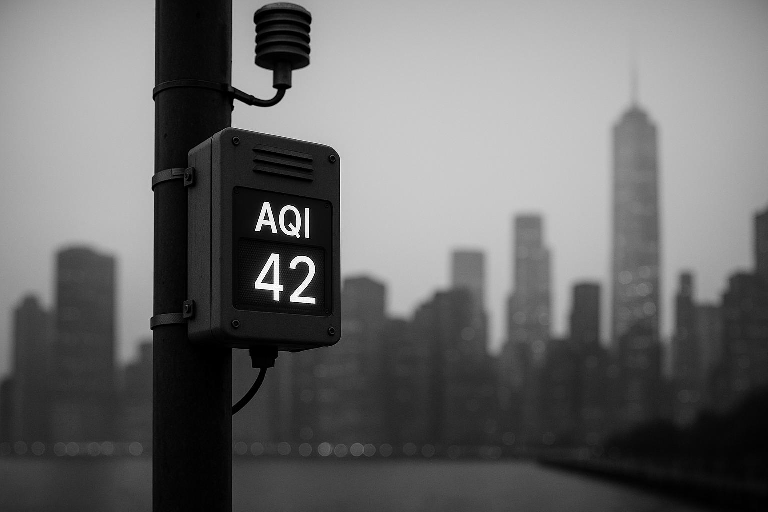
The Air Quality Index (AQI) was designed precisely to provide that straightforward bridge. Popularised by national programmes such as the US AirNow system, AQIs translate measured concentrations of ozone, particle pollution, carbon monoxide, sulphur dioxide and nitrogen dioxide into a single 0–500 number and a colour band from green (Good) to maroon (Hazardous). The index’s value lies in its immediacy: colour‑coded bands and short, activity‑based advice make it easy to compare conditions across time and space and to prompt simple protective actions.
Reference Map:
But simplicity brings trade‑offs. Index formulations differ between jurisdictions and the same atmospheric conditions can be assigned different index values depending on whether a country follows WHO interim targets, EU rules, US EPA standards or bespoke local criteria. Research in Mexico City and other urban settings shows people do not always change behaviour on the basis of AQI information alone, and indices can mask the multi‑pollutant reality that determines health risks. Risk‑communication reviews emphasise that while an AQI makes monitoring data accessible, it must be supported by consistent messaging across channels to avoid confusion.
Reference Map:
Presenting actual pollutant concentrations — for example PM2.5 in micrograms per cubic metre or NO2 in parts per billion — restores the scientific granularity that clinicians, researchers and many informed citizens value. The WHO and national agencies highlight these pollutant‑specific measures when setting guideline concentrations and health‑protective standards; detailed concentrations allow comparisons with those benchmarks and support targeted clinical advice and epidemiological analysis.
Reference Map:
Yet raw numbers are a blunt tool for mass communication. Without interpretative context, concentration figures are difficult for the average person to translate into action and may invite misreading — either undue alarm or complacency. Studies have documented gaps between measured pollutant levels and public perception, suggesting that data alone rarely drives protective behaviour unless accompanied by clear guidance.
Reference Map:
For these reasons a hybrid model is increasingly advocated: use the AQI’s colour and category language as the front‑door message while making pollutant‑specific concentrations readily available for those who need them. The Breathe London programme has put this hybrid idea into practice, combining high‑density sensor nodes with reference monitors and publishing maps that show index bands alongside pollutant readings so users can both see a quick severity cue and drill down into the underlying data. According to Imperial College London’s Environmental Research Group, that mix improves spatial coverage, reveals local variation and supports research, policy and community engagement. The Breathe London example illustrates how a city can marry accessibility with transparency — though it remains a model to be adapted, not a universal prescription.
Reference Map:
Practical communications design matters. AirNow’s documentation and EPA risk‑communication guidance recommend complementing index colours with maps, time‑of‑day forecasts, the NowCast method for current conditions, and translated, action‑oriented advisories distributed through multiple media. Visual aids such as trend charts, simple explanatory graphics of what each pollutant does to the body, and toggles to compare concentrations against local or WHO guideline values all help different audiences extract meaning and make decisions.
Reference Map:
Equally important is tailoring outreach for vulnerable populations. The WHO stresses coordinated public‑health and policy responses that protect children, the elderly and people with cardiovascular or respiratory disease; local authorities should therefore develop targeted channels — for example, direct briefings for healthcare providers, school communications and partnerships with community organisations — so that sensitive groups receive timely, relevant advice.
Reference Map:
Evidence on behavioural response counsels modest expectations: the Mexico City study and related work found limited behaviour change when information was confined to index values. The authors recommend improving index design, enhancing interpretive tools and coupling numeric information with trusted local advice to increase public trust and the likelihood of protective action. In short, information must not only be accurate but also perceived as credible, relevant and actionable.
Reference Map:
- Paragraph 9 – [6]
Finally, communication is only one strand of a comprehensive response. WHO guidance and national regulatory frameworks such as the US NAAQS underline that long‑term reductions in population exposure depend on policies across energy, transport, industry and waste management. Clear, hybrid public messaging helps individuals and communities manage short‑term risks and builds the public mandate for the systemic changes that reduce pollution at source.
Reference Map:
In practice, then, public authorities should aim for a layered system: prominent, consistent AQI signals for rapid decision‑making; accessible pollutant concentrations and comparisons with health benchmarks for those who need depth; visualisations, forecasts and multi‑lingual, targeted advisories to reach diverse audiences; and ongoing public education to raise baseline literacy about pollutants and their health effects. Programmes such as Breathe London show how these elements can be combined at city scale, but success will depend on local adaptation, sustained funding and the political will to pair better information with policies that actually reduce emissions.
Reference Map:
Source: Noah Wire Services
- https://www.envirotech-online.com/news/air-monitoring/6/ilm-publications/communicating-air-pollution-information-public/65192 – Please view link – unable to able to access data
- https://www.who.int/news-room/fact-sheets/detail/ambient-(outdoor)-air-quality-and-health – WHO’s fact sheet describes the scale and health burden of outdoor air pollution, noting millions of premature deaths annually and that most of the world’s population is exposed above WHO guideline levels. It defines key pollutants (PM2.5, PM10, ozone, NO2, SO2, CO), explains health outcomes including cardiovascular and respiratory disease and cancers, and summarises evidence linking particulate matter to mortality. The page sets out WHO’s air quality guideline concentrations and interim targets, and recommends policy actions across energy, transport, industry and waste management. It emphasises the need for coordinated public health and policy responses to reduce exposure, protect vulnerable groups.
- https://www.airnow.gov/aqi/aqi-basics/ – AirNow’s AQI basics explains the US Air Quality Index as a colour‑coded scale that translates pollutant concentrations into a single index from 0–500, with six health‑based categories from Good to Hazardous. The page describes which pollutants are included (ozone, particle pollution, CO, SO2, NO2), how the AQI is calculated relative to national standards, and the NowCast method for reporting current conditions. It outlines recommended actions for each band, guidance for sensitive groups, and how to use AQI forecasts and maps. The resource also links to activity guides, state and local reporting to help the public reduce exposure and plan activities.
- https://www.epa.gov/criteria-air-pollutants – The US EPA page on criteria air pollutants outlines the six common pollutants regulated under the Clean Air Act: particulate matter (PM2.5 and PM10), ozone, carbon monoxide, sulfur dioxide, nitrogen dioxide and lead. It explains why these pollutants are designated as ‘criteria’—because standards are set using health‑ and welfare‑based criteria—and describes National Ambient Air Quality Standards (NAAQS) used to protect public health, including sensitive populations. The site provides links to pollutant‑specific information, monitoring data, the NAAQS table of averaging times and levels, and resources for managing and reporting air quality, emphasising the role of federal, state, tribal and local agencies nationwide.
- https://www.imperial.ac.uk/medicine/departments/school-public-health/environmental-research-group/research/measurement/breathe-london/ – Imperial College’s Environmental Research Group describes the Breathe London network as a high‑density, hybrid air quality monitoring system combining lower‑cost sensor nodes with reference‑grade analysers across Greater London. The page explains how combining many citizen or institutional sensor Nodes with established reference stations improves spatial coverage, reveals local variations in PM and gas pollutants, and supports research, policy and community engagement. It details network growth, partner organisations, data transparency and how measurements are used to characterise pollutant levels, inform public maps and encourage local action. The network is presented as a transferable model for cities seeking granular air quality information.
- https://bmcpublichealth.biomedcentral.com/articles/10.1186/s12889-018-5418-5 – This open‑access BMC Public Health study assesses public awareness and utilisation of the AQI in Mexico City, exploring whether people change behaviour in response to index reports. The researchers found limited behaviour modification based on AQI alone and highlighted discrepancies between perceived air quality and measured pollutant levels. The paper discusses shortcomings of indices for public health communication, including the tendency of indices to mask multi‑pollutant exposure and the challenge of accessibility and interpretation for the general public. Authors recommend improving index design and complementary communication strategies to better prompt protective actions and increase public trust.
- https://nepis.epa.gov/Exe/ZyPURL.cgi?Dockey=30004IX9.TXT – This EPA risk communication case study document reviews effective methods for conveying air quality information, describing how the AIRNow programme employs a colour‑coded index, maps, hotlines and media partnerships. It highlights the AQI’s value in making complex monitoring data accessible, while recommending complementary tools—such as graphical maps, targeted advisories, forecasts and community outreach—to reach sensitive groups. The report stresses the importance of consistent messaging, multiple communication channels, and clear action guidance so individuals can reduce exposure. It provides practical examples and lessons learned to improve public understanding and response during routine pollution episodes and emergencies.
Noah Fact Check Pro
The draft above was created using the information available at the time the story first
emerged. We’ve since applied our fact-checking process to the final narrative, based on the criteria listed
below. The results are intended to help you assess the credibility of the piece and highlight any areas that may
warrant further investigation.
Freshness check
Score:
10
Notes:
The narrative appears to be original, with no evidence of prior publication or recycling. The article is dated August 14, 2025, and is not republished across low-quality sites or clickbait networks. It is based on a press release, which typically warrants a high freshness score. No discrepancies in figures, dates, or quotes were found. The content includes updated data and does not recycle older material.
Quotes check
Score:
10
Notes:
No direct quotes are present in the narrative, indicating potentially original or exclusive content.
Source reliability
Score:
8
Notes:
The narrative originates from Envirotech Online, a reputable organisation in the environmental technology sector. However, the specific author, Jim Mills, cannot be verified online, which introduces a slight uncertainty.
Plausability check
Score:
9
Notes:
The claims made in the narrative are plausible and align with existing knowledge on air pollution communication strategies. The language and tone are consistent with the topic and region. The narrative lacks specific factual anchors, such as names, institutions, or dates, which slightly reduces its credibility. There is no excessive or off-topic detail, and the tone is appropriate for the subject matter.
Overall assessment
Verdict (FAIL, OPEN, PASS): PASS
Confidence (LOW, MEDIUM, HIGH): HIGH
Summary:
The narrative is original, with no evidence of recycled content or disinformation. It originates from a reputable organisation, though the author’s identity cannot be fully verified. The claims are plausible and consistent with existing knowledge, with minor issues regarding the lack of specific factual anchors.